
Video style · A practical guide
Infographic Animation
Infographic animation uses moving charts, numbers, icons and diagrams to explain information. It is useful when viewers need to understand a comparison, a trend or the stages of a system.
See the style in action
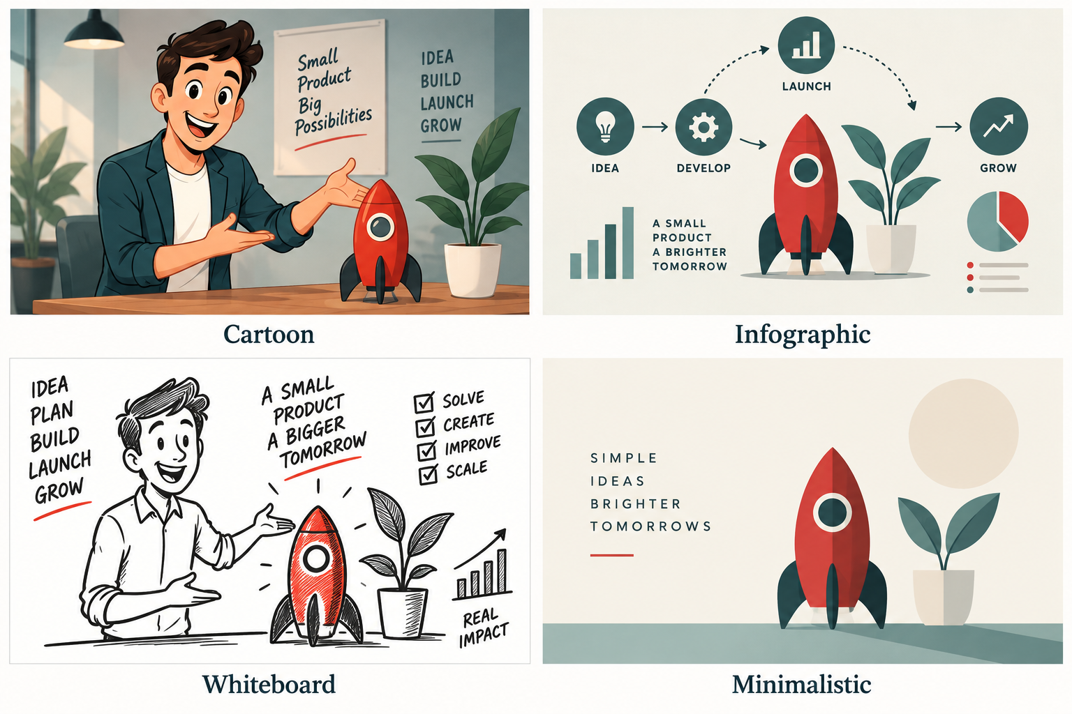
Information, visual symbols and sequencing work together to explain the subject.
Make the meaning visible
Begin with the conclusion the audience needs to understand, then select the information that supports it. A chart should answer a question rather than decorate the screen. Reveal labels and values at a pace that gives viewers time to connect them.
Keep the data honest
Provide the source, date, units and relevant context for each figure. Avoid changing chart scales or omitting categories in a way that exaggerates the story. If a figure is an estimate, label it accordingly. Animation should clarify the evidence, not make it appear stronger than it is.
Useful business applications
An animated infographic can explain a survey, an annual update, a service journey or the findings of a report. For example, a transport overview might show how different stages connect, then highlight where a proposed change would apply. This is an illustrative structure, not a claim about a particular project.
Design for understanding
Use a small number of visual conventions consistently. Keep text readable, describe important conclusions in narration or captions and avoid relying only on colour to distinguish categories. Offer the underlying report or a text summary when viewers need more detail.
Common questions
Is it only for statistics?
No. It can also explain a process, relationship or timeline using diagrams and icons.
How much data should one video contain?
Include enough to support the main conclusion. Split unrelated findings into separate chapters or videos instead of filling every frame with numbers.